Creating maps with CityTracker

Attribution: Maps using OpenStreetMap + Leaflet
At CityTracker.ai, we love maps, and we create lots of them. We summarize tax lots, filings, permits, sales. Basically, everything we can get our hands on.
On social media, a common question is: "How do you create these maps"? And the real answer we want to give is: "It's real easy, you should do this yourself!" But up to now, we couldn't say this, since we hadn't really explained how it works. So let's fix this!
Let's say we want to understand townhouse combinations. We'll start from scratch: https://citytracker.ai/results/tab/map. Map to the right, filters to the left. We're looking at filings, but of course everything works similar if you'd be looking for permits or sales.
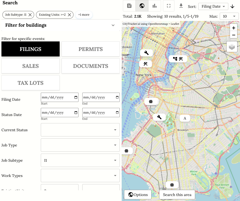
- The map panel (right) gives you a range of features:
- On the top right, you can select layers (e.g. Satellite views).
- The map shows the most recent filings (adjust number at top right). You can click on them to get details
- If you zoom in, you can filter for filings in that area using "Search this area".
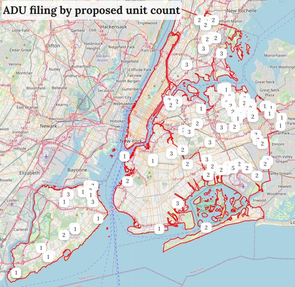
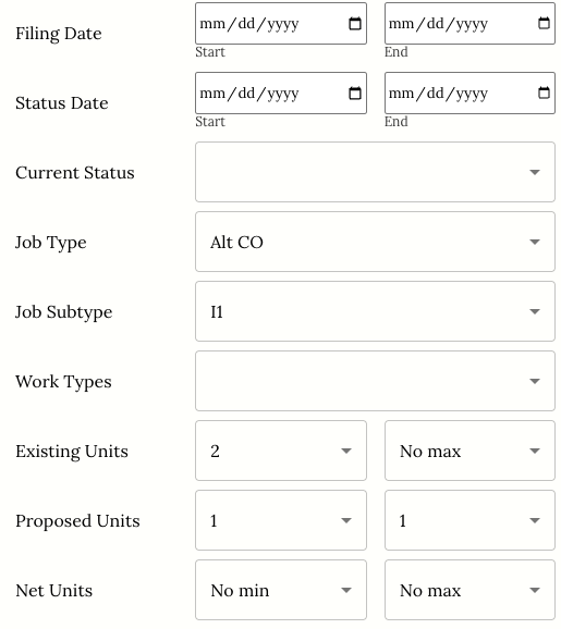
- The filters are to the left. Here, we're looking for townhouse combos (unit reduction towards 1 unit)
Let's focus on the map now (full screen), and then look at the map options.
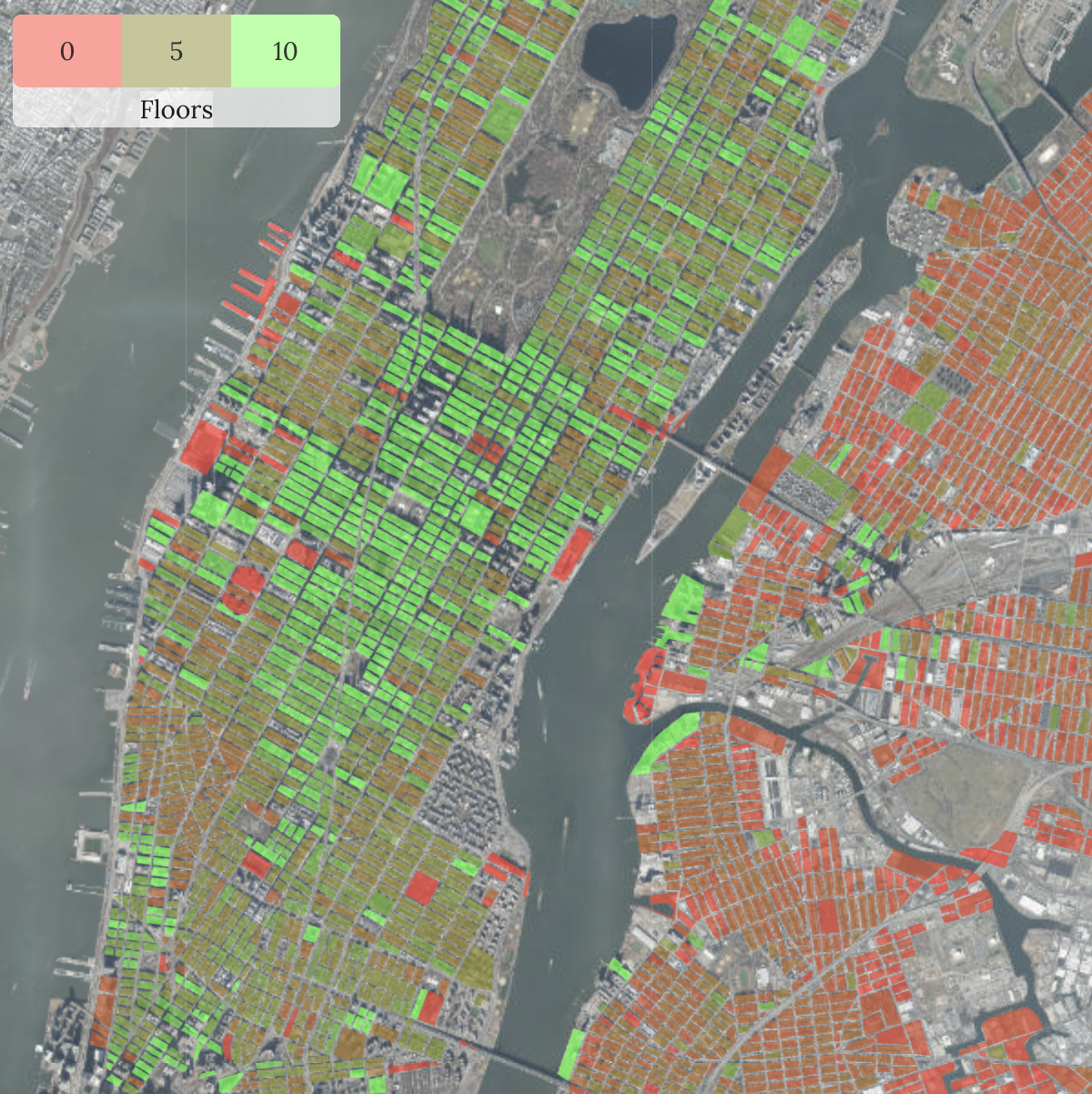
Markers
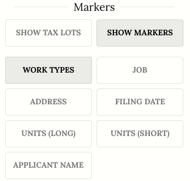
You have a wide choice of display and marker labels, e.g. job type, date, or applicant. The choice will depend on the event you're searching for, e.g. for if you searched for sales you would see the $ amounts as an option.
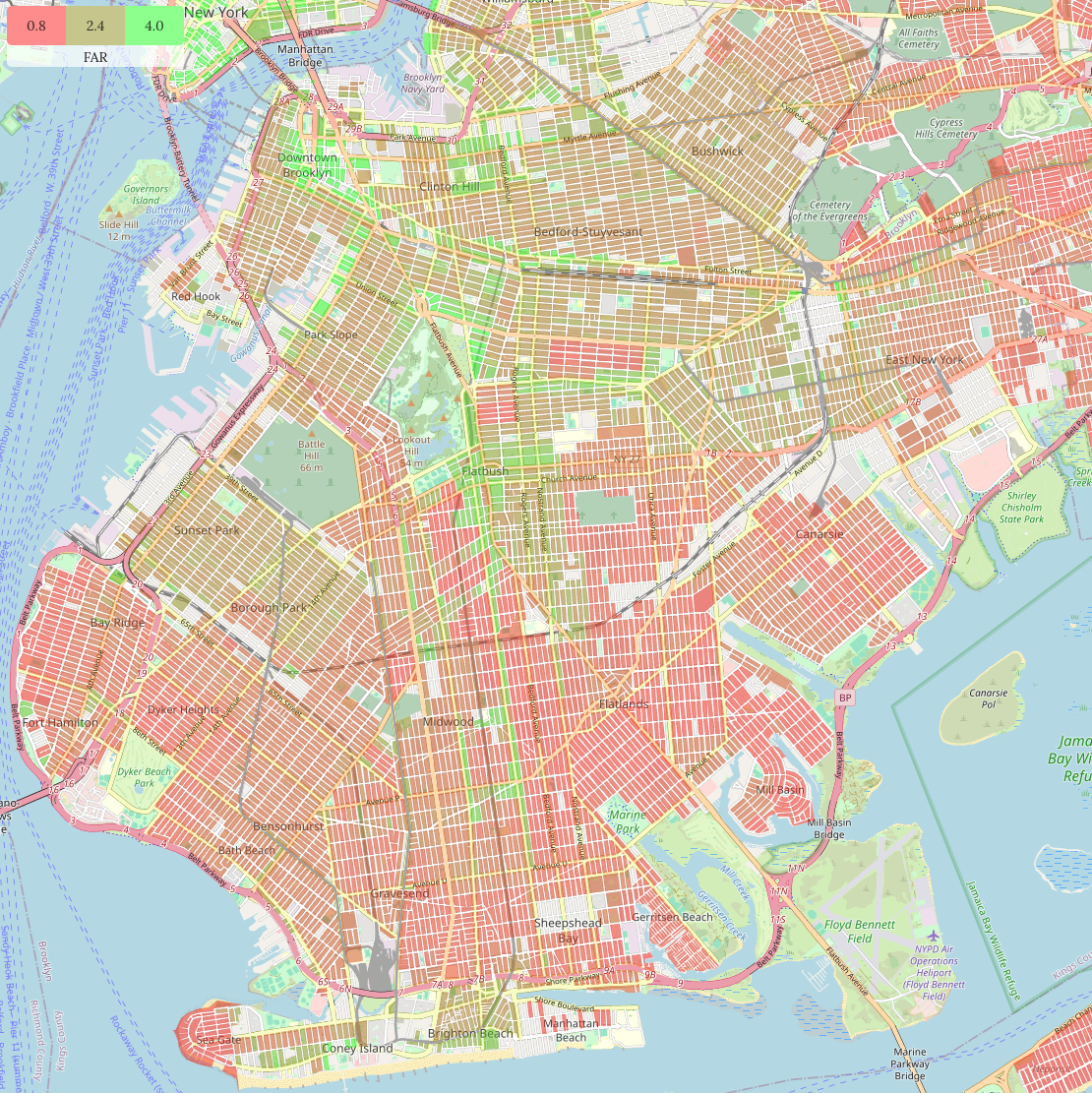
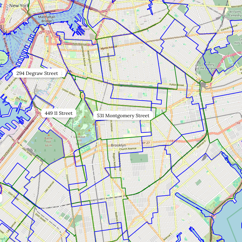
Overlays
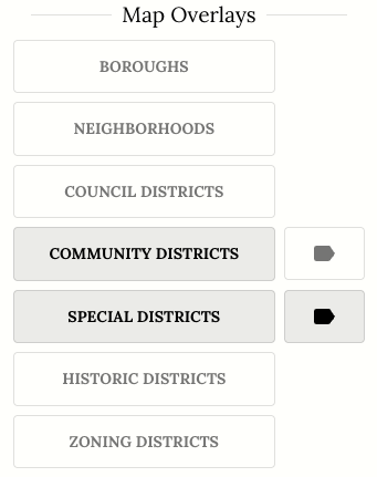
You can then add a bunch of overlays. For example, you'll learn that community districts (green) have partial overlap with council districts (blue), leading to the often-confusing politics of NYC community boards.
Summaries
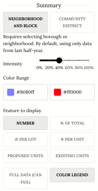
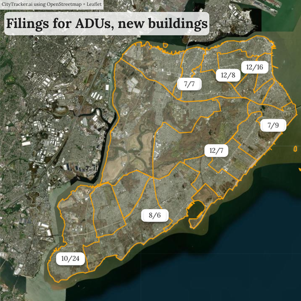
To us, the best feature are the summaries. Given any filter, we aggregate the data live and show you an overview by neighborhood.
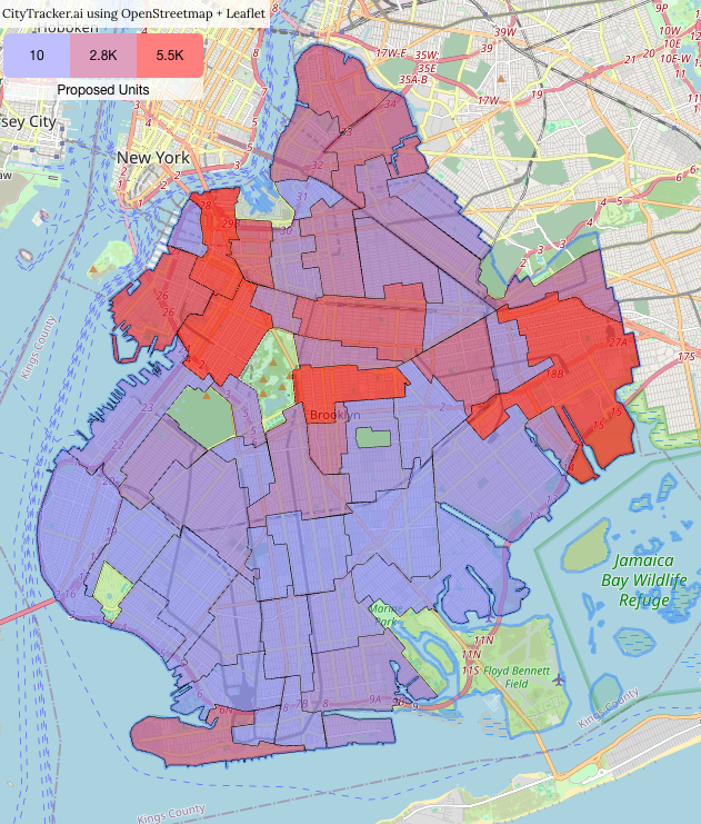
So let's remove the markers and overlays, and instead add a neighborhood summary. You could also summarize by community district, and other aggregations like zip code or council will be added soon.
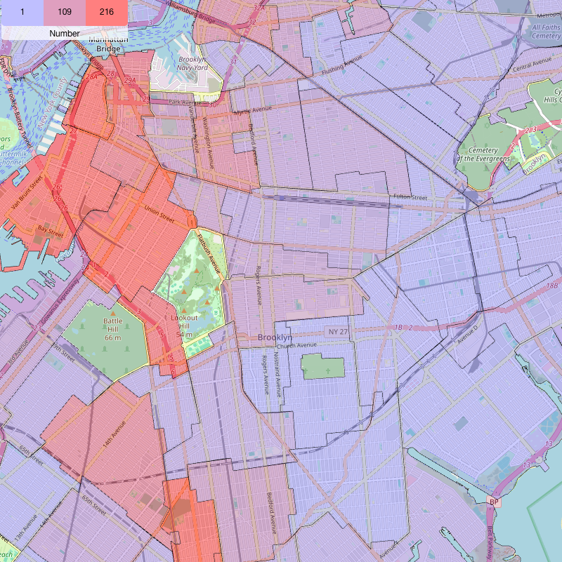
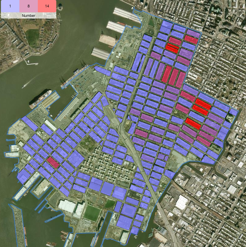
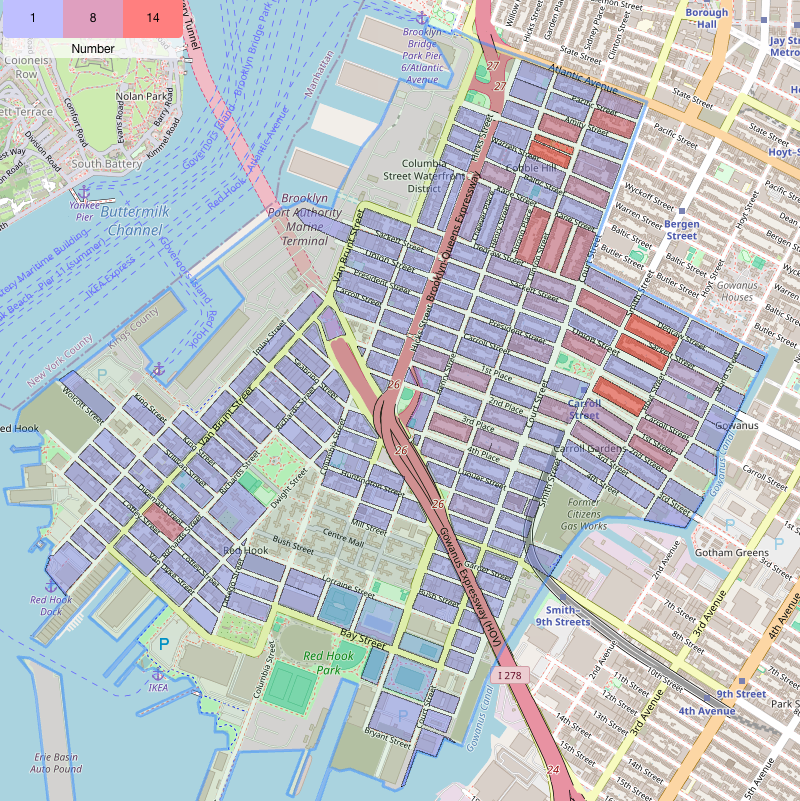
If you click on a neighborhood, you zoom into it and see results by block.
By default, this uses data from the last half year. You can search for all data (click the button "Full Data, can fail"), but it's a data-intensive operation that might not succeed – we're working on it.
By default, we just show a raw count, but there are times when this isn't the right unit. For example, if you want to find out where new housing gets built, you probably want to sum the number of proposed units.
We let's change the filters to look for new construction and ... look at that: There's actually lots of new units proposed in Park Slope, that's surprising — and we'll let you click more to find out what's going on there.
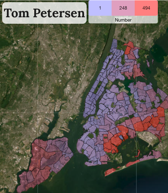
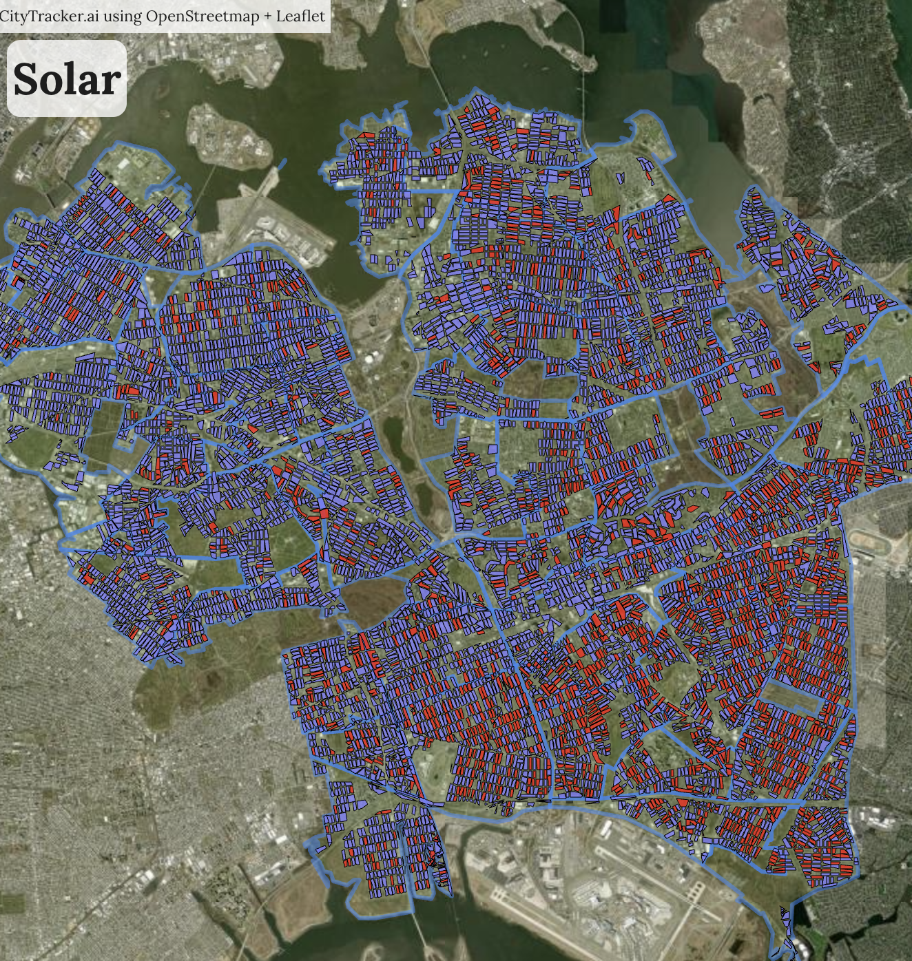
Our super-secret Map Design
We usually use the following when sharing maps online. The reason is that we simply find it pretty while still being informative.
- Select a satellite view (2024 looks nicest but doesn't have full coverage when zoomed out, in that case you can use global)
- Add a neighborhood summary at 80% intensity
- Optional: Add a map title and the most relevant overlays